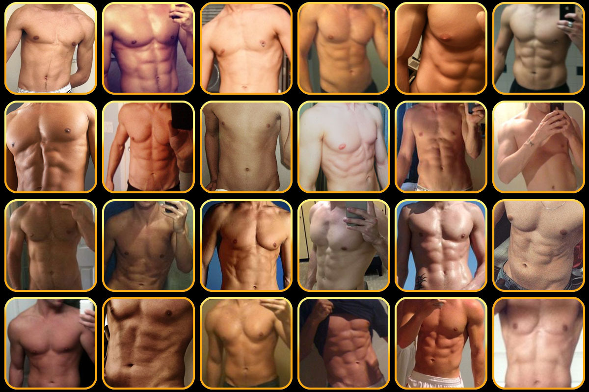
The Headless Torso: Communicating on Gay Apps

The emergence of location-based dating applications such as Grindr, Tinder, and Jack’d, has forever changed the way we as a minority group are able to communicate with each other. We utilize these tools for meeting new friends, finding potential dates, locating hookups and sex, and even advertising a product or brand we own. Many of us who already have boyfriends and strong social networks continue to utilize these applications to further expand our social spread. Regardless of what we use these for, statistics show that millions of men across the world use these apps on a daily basis for a diversity of purposes.
Maps of men
Yoel Roth at the University of Pennsylvania released a fascinating analysis of how these tools use the coordinates of real humans to create a “geosocial map.” More specifically, the idea of “mapping” is deconstructed, proposing that these maps are not limited to the relative locations of men, but also their relationships to each other, to the site itself, and to the gay community as a whole. Companies that develop these applications also have the ability to influence how their product is used by engaging different styles of the user interface.
How does user experience (the “interface”) influence utility?
My favorite topic explored by Yoel is the concept of how each application’s user interface is designed to influence human behavior. The limitations or open possibilities each unique application presents the user with distinctly shape how he expresses his relationship with his own body, with other users, the community as a whole, and the application itself.
Take, for example, how Grindr limits its users to one profile picture on the landing screen for each Grindr profile. Although users are allowed to send more pictures to other users once a chat has begun, unlike Jack’d and Tinder that allows for multiple pictures to be housed on each profile, Grindr functions on a platform designed for those who are quickly scrolling through. This setup also presents the user with some very important marketing choices. How does one optimize their social experience on Grindr with one picture? What are some choices users can make when choosing this landing picture?
Headless torsos vs. faces: using the app for different reasons
We are constantly sending messages to those who are physically around us via body language, sound, and verbiage. On a digital platform, we are significantly limited in how our messages are sent and processed. Therefore, whether we are making a conscious or subconscious choice in intention, the choice of a profile picture (especially on an app that only allows for one picture) generally sends a message that speaks to why we are using the app.
Those who display headless pictures of their abdomens on these sites are usually using Grindr with the sole intention of finding sex. Conversely, those who use pictures of faces generally see Grindr as a more multi-functional application, not only for sex but for seeking out friends, finding out about events, and for other purposes.
Although not covered in the paper referenced above, another picture option is to choose to have no photo at all. In my personal experience, I have noticed that oftentimes these profiles still contain information about the individual or their interests, but the absence of a picture leaves much to question. I would predict that those who have no picture would also fall into a similar category as the headless torso, using the application primarily for hookup purposes. Users who do not have a picture are also aware that they will receive less communication traffic (because people are less likely to start chatting with a blank profile). Therefore, it is possible that these individuals also choose to have no picture in order to maintain control, only making conversation and sending pictures to people they want to chat with.
Zero feet away – perpetuating a hook-up culture
For many users, the primary objective of using a gay dating application is to be “zero feet away,” or to meet face-to-face. Not everyone on these sites is looking for sex, but the majority of users are looking for some form of in-person meet-ups such as dates, making friends, or other options. Grindr (and other associated applications) thrive off continued use by existing users, therefore it is not in their best interest for users to “turn off” these applications once they meet.
Whether good or bad, applications such as Grindr have user experience interfaces that are designed to promote hookups and sex rather than dating. This promotes and perpetuates the overall usage of their app. It’s really a brilliant business model, urging users to stay on rather than find a dateable guy, become sexually exclusive, and delete the app. When we do encounter a couple that had met on Grindr, we often assume that their relationship is inherently set to fail by virtue of how they met.
