Men for Men: Geosocial Mapping & User Experience

If you are reading this article you probably stumbled upon it by by searching for keyword combinations like “men for men.” A term often coupled with actions such as “looking,” this phrase is often characterized by men who are seeking other men for sex, however it could also describe men who are looking for dates or the company of other men. Nonetheless, individuals who are “men for men” use a variety of tools and apps that serve many functions, from social networking to basic sex.
What we find so fascinating about the psychology behind the use of each application or website is that they serve individual purposes based on the interface and user experience. Although we briefly touched on what is referred to as “geosocial mapping” in our article titled The Headless Torso: Communicating on Gay Apps, we wanted to go into further detail by including several web-based applications and websites. By analyzing the ways users engage with each application or web-based service, we can better understand the intention behind the design.
So what are these applications and websites that constitute the “men for men” experience? Here are three types of services that answer this call in a multitude of ways.
1. Grindr
Mobile app characterized by a single-photo profile and hookup scene
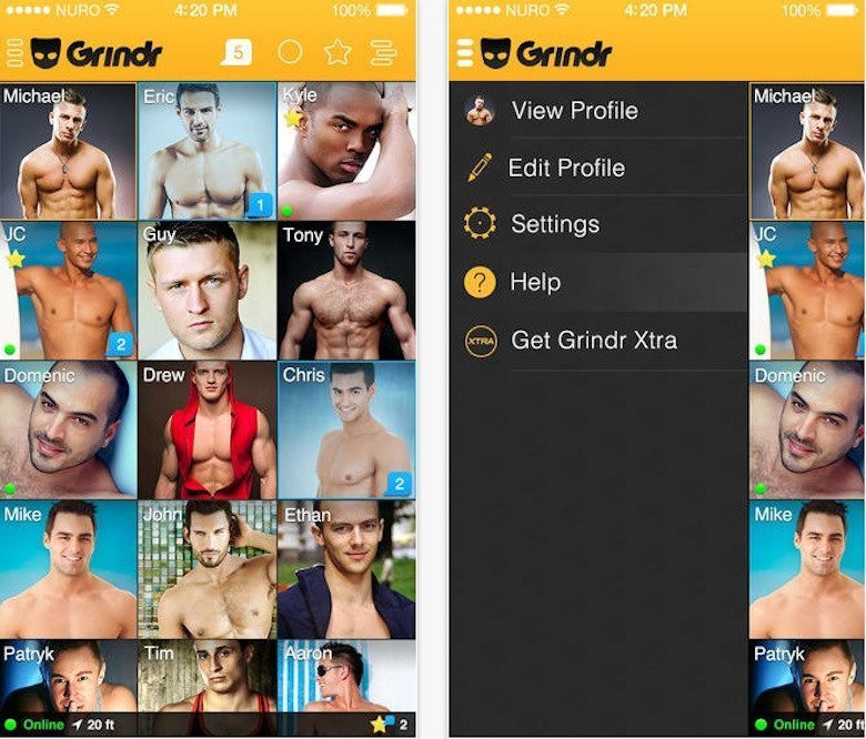
As we stated before, Grindr limits their users to one profile picture on the landing screen for each profile. Although users are allowed to send more pictures to other users once a chat has begun, unlike Jack’d and Tinder that allow for multiple pictures to be housed on each profile, Grindr functions on a platform designed for those who are quickly scrolling through.
This setup also presents the user with some very important profile choices. How does one optimize their social experience on Grindr with one picture? What kind of message does a smiling profile shot portray compared to a headless torso?
Regardless of user intent, Grindr is designed to motivate users to be “zero feet away,” or to finally meet in person. However, the limited profile picture and content options diminish the amount of information that is shared on a single profile, thus perpetuating hookups by listing only “the essentials.” Pertinent physical information such as racial background, height, weight, and a single photo sums up the majority of information Grindr feels necessary to share between users. Whether good or bad, Grindr is designed to promote hook-ups and sex rather than dating. This promotes and perpetuates the continued usage of their app.
2. Craigslist
Web-based service offered in hundreds of cities around the world with a notorious “personals” page
Whether we personally use Craigslist to find guys, or we have friends who prefer using this website over mobile applications, it is apparent that the design and functionality is entirely different from mobile apps. Unlike Grindr and Jack’d, Craigslist only requires one user to create a post that anyone is able to view. Instead of creating an initial two-user design, this path of communication allows users to make very specific requests in their “profile,” or single Craigslist post. This functions as a jumping-off point from which users can either respond or move on to the next post.
Having lived in the Bay Area for several years, I came to develop a more open-minded understanding and approach to the personals page on Craigslist. A site that I had originally deemed as dirty, or even scary, was transformed by several of my friends simply into a different means by which people can obtain sex with men. For example, one of my friends who had a very specific interest in “edging” found Craigslist more successful in sourcing qualified men compared to spending hours scrounging for a response on Grindr.
Most notably, Craigslist cares less about time and immediate response due to the fact that one cannot view whether the author of a post is online at that moment. A muted urgency for response coupled with the absence of an “x feet away” notifier allows users to spend less time sorting through non-matches, especially when they have specific desires in mind.
3. Tinder
Mobile app characterized by its “swiping” capabilities
What’s most notable about this application is the fact that users select each other prior to being able to even initiate a conversation. With the ability to list several photographs and a much more extensive text space for each user’s profile, this allows users the ability to get to know each other better before even starting to talk. Although some simply swipe right or left based on the aesthetics of the first picture they see, the intent behind the application is for users to reveal more about themselves in comparison to Grindr, or even Jack’d.
Additionally, the fact that users select each other functions as either a passive or active conversation-starter. Each user is given the confidence that they are already talking to someone who is interested in them, and therefore a major first conversation is figuring out what the other individual found appealing about the content listed on the Tinder profile. The increased ability to share more information with the “weeding-out” function of pre-selection increases the odds that users will go on successful dates and meetups. Due to the larger investment (of time and energy) on behalf of each user, the odds of meetups beyond hooking up and sex is increased as well.
